样式化内容
border(_:width:)
使用指定的样式和宽度为此视图添加边框。
func border<S>(
    _ content: S,
    width: CGFloat = 1
) -> some View where S : ShapeStylecontent: 符合ShapeStyle协议的值,如Color或HierarchicalShapeStyle,SwiftUI 用于填充边框。width: 边框的厚度。默认值为像素。
使用此修饰符在视图的框架周围绘制指定宽度的边框。默认情况下,边框出现在此视图的边界内。例如,你可以添加一个覆盖文本的四像素宽的边框:
Text("Purple border inside the view bounds.")
.border(Color.purple, width: 4)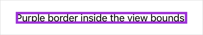
要在此视图的外部放置边框,请在添加边框之前应用相同宽度的填充:
Text("Purple border outside the view bounds.")
    .padding(4)
    .border(Color.purple, width: 4)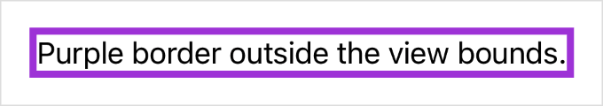
foregroundStyle(_:)
设置视图的前景元素使用给定的样式。
func foregroundStyle<S>(_ style: S) -> some View where S : ShapeStylestyle: 用于填充前景元素的颜色或图案。要指定特定的值,请使用Color或image(_:sourceRect:scale:),或其中一种渐变类型,如linearGradient(colors:startPoint:endPoint:)。要设置相对于包含视图样式的样式,请使用其中一种语义样式,如primary。
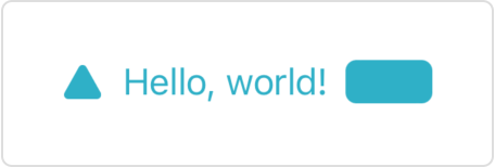
使用此方法设置前景内容的样式,如文本、形状和模板图像(包括符号):
HStack {
    Image(systemName: "triangle.fill")
    Text("Hello, world!")
    RoundedRectangle(cornerRadius: 5)
        .frame(width: 40, height: 20)
}
.foregroundStyle(.teal)
上面的示例创建了一排蓝绿色的前景元素:
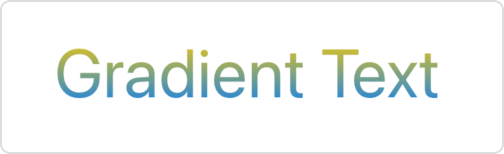
你可以使用任何符合 ShapeStyle 协议的样式,如上面示例中的蓝绿色,或下面显示的 linearGradient(colors:startPoint:endPoint:) 渐变:
Text("Gradient Text")
    .font(.largeTitle)
    .foregroundStyle(
        .linearGradient(
            colors: [.yellow, .blue],
            startPoint: .top,
            endPoint: .bottom
        )
    )
TIP
如果你想使用样式填充单个 Shape 实例,请使用 fill(style:) 形状修饰符,因为它更高效。
SwiftUI 为给定的样式创建上下文相关的渲染。例如,从资产目录加载的颜色可以具有不同的亮色和暗色外观,而某些样式也因平台而异。
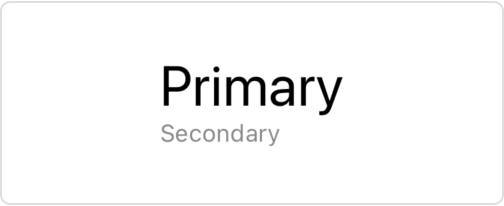
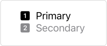
像 ShapeStyle/secondary 这样的分层前景样式不会强加自己的样式,而是修改其他样式。特别是,它们将当前前景样式的主要级别修改为分层样式名称所给定的程度。要查找要修改的当前前景样式,SwiftUI 会查找使用 foregroundStyle(_:) 或 foregroundColor(_:) 修饰符应用的最内层包含样式。如果您没有指定样式,SwiftUI 将使用默认的前景样式,如以下示例所示:
VStack(alignment: .leading) {
    Label("Primary", systemImage: "1.square.fill")
    Label("Secondary", systemImage: "2.square.fill")
        .foregroundStyle(.secondary)
}
如果在封闭的 VStack 上添加前景样式,分层样式将相应地响应:
VStack(alignment: .leading) {
    Label("Primary", systemImage: "1.square.fill")
    Label("Secondary", systemImage: "2.square.fill")
        .foregroundStyle(.secondary)
}
.foregroundStyle(.blue)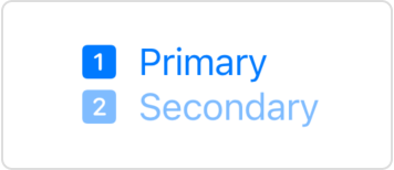
当你将自定义样式应用于视图时,该视图会禁用该视图或其任何子视图中前景元素的活力效果,否则这些元素将通过添加背景材料(例如,使用 background(_:ignoresSafeAreaEdges:) 修饰符)获得。但是,应用于默认前景的分层样式不会禁用活力。
foregroundStyle(_:_:)
设置子视图中前景样式的主要和次要级别。
func foregroundStyle<S1, S2>(
    _ primary: S1,
    _ secondary: S2
) -> some View where S1 : ShapeStyle, S2 : ShapeStyleprimary: 用于填充前景元素的主要颜色或图案。要指定特定的值,请使用Color或image(_:sourceRect:scale:),或其中一种渐变类型,如linearGradient(colors:startPoint:endPoint:)。要设置相对于包含视图样式的样式,请使用其中一种语义样式,如primary。secondary: 用于填充前景元素的次要颜色或图案。
SwiftUI 在渲染没有显式渲染样式的子视图(如图像、文本、形状等)时使用这些样式。
如果你没有显式指定其他模式,当你应用此修饰符时,视图层次结构中的符号图像将使用调色板渲染模式。
backgroundStyle(_:)
设置指定的样式以在视图内渲染背景。
func backgroundStyle<S>(_ style: S) -> some View where S : ShapeStyle下面的示例使用此修饰符将 backgroundStyle 环境值设置为包含微妙渐变的蓝色。SwiftUI 使用此样式填充用作背景元素的 Circle 形状:
Image(systemName: "swift")
    .padding()
    .background(in: Circle())
    .backgroundStyle(.blue.gradient)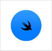
要恢复默认背景样式,请使用 environment(_:_:) 修饰符将 backgroundStyle 环境值设置为 nil:
.environment(\.backgroundStyle, nil)ShapeStyle
渲染形状时使用的颜色或图案。
protocol ShapeStyle : Sendable你可以通过声明一个符合 ShapeStyle 协议的类型并实现所需的 resolve 函数来创建自定义形状样式,该函数根据当前环境返回表示所需外观的形状样式。
例如,此形状样式从环境中读取当前颜色方案,以选择其颜色将与之合成的混合模式:
struct MyShapeStyle: ShapeStyle {
    func resolve(in environment: EnvironmentValues) -> some ShapeStyle {
        if environment.colorScheme == .light {
            return Color.red.blendMode(.lighten)
        } else {
            return Color.red.blendMode(.darken)
        }
    }
}
除了创建自定义形状样式外,你还可以使用 SwiftUI 定义的具体样式之一。要指定特定的颜色或图案,你可以使用 Color 或 image(_:sourceRect:scale:) 返回的样式,或其中一种渐变类型,如 radialGradient(_:center:startRadius:endRadius:) 返回的样式。要在给定平台上的给定上下文中设置合适的颜色,可以使用其中一种语义样式,如 background 或 primary。
你可以通过以下方式使用形状样式:
- 使用
fill(_:style:)修饰符用样式填充形状:
Path { path in
    path.move(to: .zero)
    path.addLine(to: CGPoint(x: 50, y: 0))
    path.addArc(
        center: .zero,
        radius: 50,
        startAngle: .zero,
        endAngle: .degrees(90),
        clockwise: false)
}
.fill(.radial(
    Gradient(colors: [.yellow, .red]),
    center: .topLeading,
    startRadius: 15,
    endRadius: 80))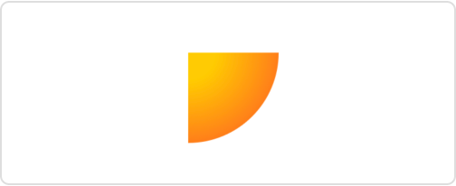
- 使用
stroke(_:lineWidth:)或stroke(_:style:)修饰符用样式描边形状的轮廓:
RoundedRectangle(cornerRadius: 10)
    .stroke(.mint, lineWidth: 10)
    .frame(width: 200, height: 50)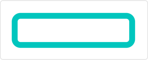
- 使用
foregroundStyle(_:)修饰符设置视图中前景元素的样式:
VStack(alignment: .leading) {
    Text("Primary")
        .font(.title)
    Text("Secondary")
        .font(.caption)
        .foregroundStyle(.secondary)
}